30 Oct, 2020
Power BI – Summarize Visuals/Reports Using Smart Narrative
Posted on 30 Oct, 2020 by Admin, Posted in
Power BI
 Blogs
Blogs
Introduction
- Many times, we see users use PowerPoint, text boxes, interactive headers, or custom visuals to add narrative to their data. All these options either lack interactive data, customizable text, or useful automatic insights.
- Power BI has a new feature of Smart Narrative which helps you quickly summarize visuals and reports by providing relevant OOB insights that re customizable.
- Let us see how to enable and use the feature.
Smart Narrative Feature
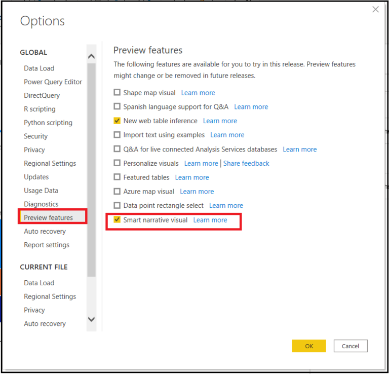
- Since this feature is in preview, you will need to first turn on the feature switch by going to
File > Options and Settings > Options > Preview feature and make sure Smart Narrative visual is turned on:
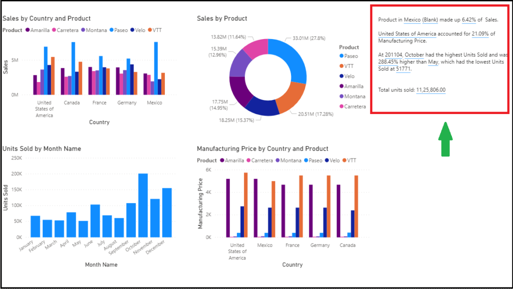
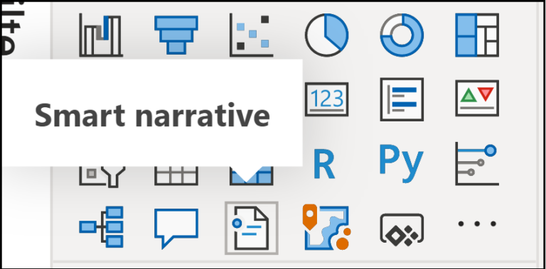
- Clicking on the new smart narratives icon in the visualization pane creates a narrative based on all the visuals on the page.
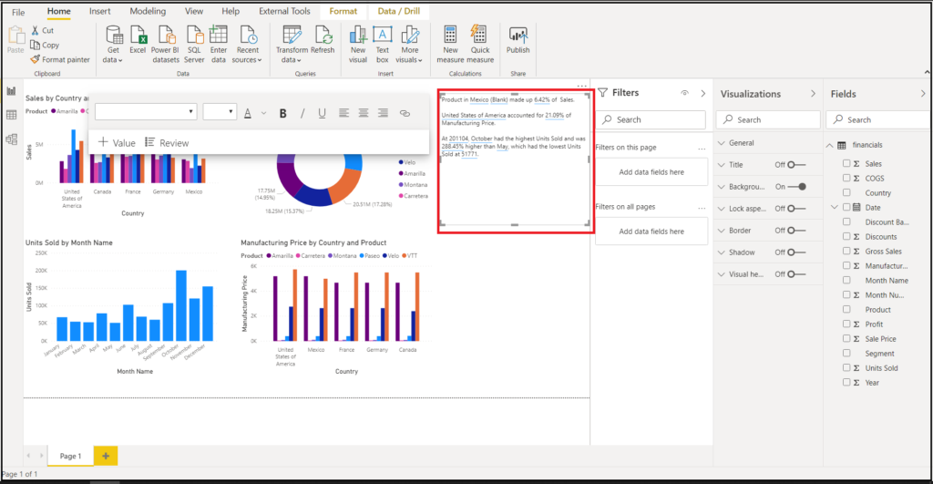
- For example, clicking on the icon for the below report automatically generates a summary of the visuals in the report. Notice that Power BI automatically does trend analysis as well.
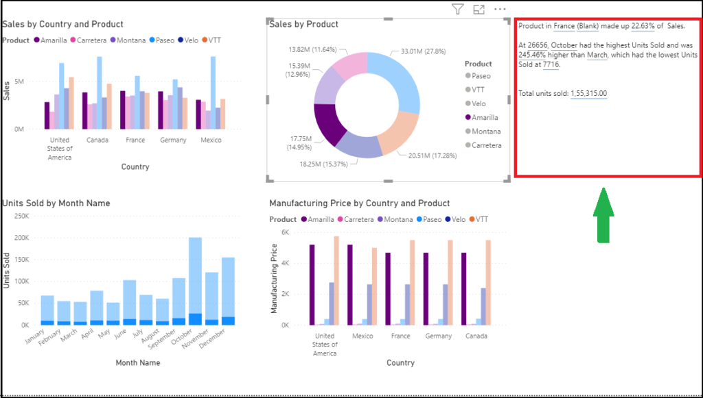
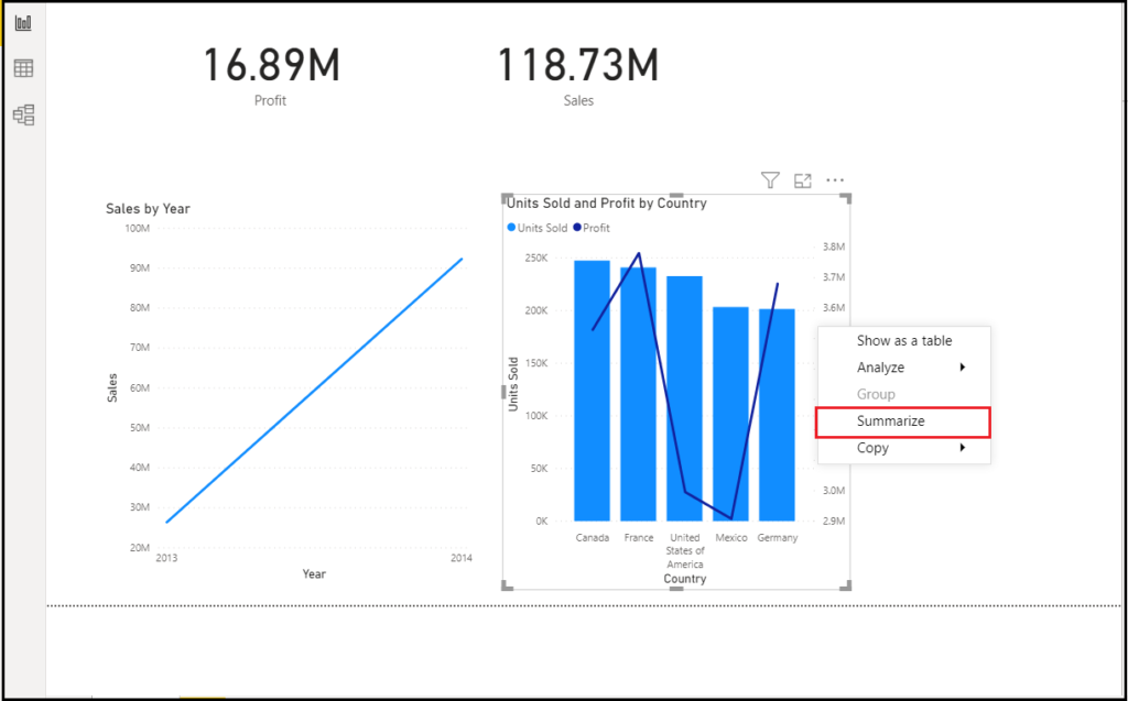
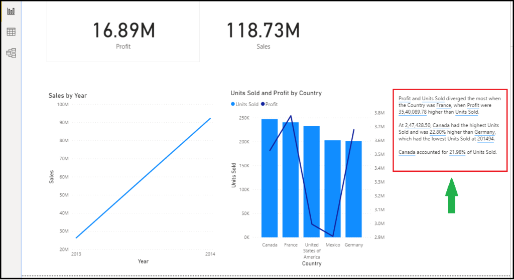
- You can also right-click the visual and select ‘summarize’. This will generate an automatic summary of that visualization. For example, when you right click on the units sold and profit by country, it will summarize the data and give you insights and even show you trends.
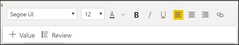
- The summary is highly customizable where you can add new text or edit the existing text using the same controls available in the regular text box. For example, you can make the text bold or change the text color.
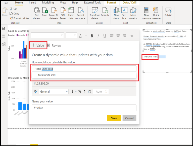
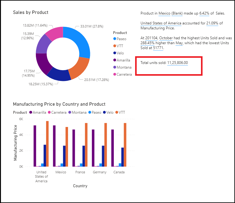
- You can also customize the summary and add your own insights by adding dynamic values. You can map text to existing fields and measures, or use natural language to define a new measure to map to text. For example, if you wanted to see the total number of units sold, you can use the add value option.
- As you type, you’ll get suggestions in a drop-down just as in a Q&A visual and you can just save this as a value. So, in addition to being able to ask questions of your data in Q&A, the scope has been expanded to create your own calculations without even doing DAX.
- The summary is dynamic and automatically updates the generated text and dynamic values when you cross filter. For example, the below report shows the summary based on the visualizations, but if you select a single product type the rest of the report will filter according to it and also the summary will filter as well.